Reflective Evaluation

Overall I am very happy with my website’s design, navigation, logo, branding and galleries. I had always had a rough idea of what kind of website I wanted and that was one that the design would let the photographs speak, as to me this is the most important part of the website. I feel that I have succeeded in doing this by a few different peoples responses in my class and also friends on Facebook who have had a look at it.

The design is simple, but I hope effective! Although this is the end of the module, I feel that I have picked up enough skills in Dreamweaver to carry on with simple editing of the design, or adding extra galleries (projects) to the navigation to keep my website up to date with my work, after the module has finished. I feel that this is important as photography is a very competitive field and so having a up to date website of my work is essential in the field.

I am going to take the feedback from my college (Peter) into consideration as I feel he made some good points on how I could improve the layout, for example I plan to make a space (gap) between the list of my image galleries and the ‘about’ & ‘contact’, this will make the ‘about’ & ‘contact’ defiantly stand out a lot more to the viewer, rather than at the moment they just look like they are at the end of a long list. I tried to prevent this from happening by using different size fonts, smaller size for the subheadings and larger for the main headings, but I now feel that the size difference is not big enough and they appear almost the same size, meaning the main headings are not as easily distinguishable as I had hoped they would look.

As I said in a post on here a long time ago, I planned to make two separate websites, one in Dreamweaver for my most professional photographic work (this one), and the other a more informal and day – to – day selection of less professional photographic work I do, for example photos I take every day on my mobile phone. I have not done the latter yet, which I plan to make in Lubith and WordPress, but I would like to make it in the next few weeks while my ideas and skills are still fresh. Hopefully this will give me a insight into how different it is to design, build, use, and maintain the different kinds of website building programmes.

I feel that this module for me has been so valuable as had I not done it I would defiantly not have a website with my name on it! And having my own logo and website makes me proud, I have just posted my (now live) website onto facebook for all my friends to have a look at. In todays digital age it is so important to have your business/company information on the WWW as it is such a valuable tool for instant access and information.

So please have a look at my website:

http://www.avphoto.co.uk

Going LIVE!

So, my website is working on Dreamweaver and I have checked it through the browsers and it all works fine.

Now I am going to go live, here is my process:

In Dreamweaver I go to Site>manage site> double click on the correct site.going, live, dreamweaver, how, to

Then the ‘site set up’ box will open and I click on ‘servers’, which looks like this:going, live, dreamweaver, how, to

This is where I add the server info who will be hosting my website. So I double click on the site ‘Alice’ and the ‘site setup’ box comes up where I enter all my private info and passwords. OnceI have done this I click ‘ok’ to go back to the main screen then click on ‘Expand to show local and remote sites’ in the bottom right hand box, then this box appears:Screen Shot 2013-05-22 at 13.29.14I then click on the first button in the tool bar, which connects, then all the files appear in the left hand column as well as the right. DONE!

Designing my business card

I am going to design a business card for Alice Volk Photography as I feel that it will be important to have them at both my upcoming shows this month.

I want the design to be very simple and I will be carrying my branding from my website onto it as well as this keeps my corporate identity consistent through all marketing materials. my website design was all in black and white as most of my photographs are also black and white, also I feel b&w is professional as colour can be a distraction.

I have made them the standard UK size and I have used my logo and branding from my website on my card and also one of my recent images that is in black and white on the back, this is the front: business, card, photographer, photography, design, layout, branding, logo, alice, volkand the back:business, card, photographer, photography, design, layout, branding, logo, alice, volk

It is times like this when I feel happy to have spent time deciding on my logo and branding because I am proud and happy with how my busniess card looks with the branding and logo from my website. I think that the consistent use of my branding is important because for example, if someone see’s my photographs in my show, then takes a business card, then later on goes onto to my website having already seen my logo and branding on the card, as soon as they see the website they will know they are in the right place as they will recognise my logo. This is always important because when you recognise something you get a sence of relief because its something you already know.

Making a CV

I am going to make myself a new CV that is relevant to the kind of creative work I would like to apply for after I finish my degree. Currently my CV is completely irrelevant as I have been working in hospitality and retail for the last 10 years. From the experience in hospitality I am going to take only one of the jobs I have done into my new CV as I feel that it is relevant because I was a shift supervisor and had a lot of responsibility.

I am going to firstly draft out my new CV in Word as I am starting it from scratch I want to make sure it is all spelt correctly etc, then once I am happy with the words I will take them into Photoshop and I can start playing around with how it looks and the layout, fonts, colours, adding my logo and branding.

Here is my finished version: (first page only)creative, photographer, photography, cv, curriculum vitae

I have made it A4 as this is the print size it will be, but I have made it landscape rather than portrait as this will mean its more easily read if viewed on a screen, which happens more and more these days like applying for jobs online. I have also designed the layout and branding so that the CV can be added onto my website as I have made a page especially for ‘About’ me. I have edited the one that is for my website slightly, the only thing that is different about the design is that it has no logo, as my website already has my logo in the top left hand corner, so I have moved up my info like phone number etc, please see below:CV, creative, photographer, photography,

To have all of this information on my website is important because it means that the viewer can get a little bit of background information about me and what kind of work I have done in the creative field. I feel it also makes the website more professional, not to look at, but because I have supplied the viewer with this additional information AS WELL as my photographs. In todays digital age most people have a camera and so there are millions of websites, blogs, intragram, Flickr & facebook groups that all peoples personal photographs get put online. So I hope that this information on my website will encourage the viewer to contact me if they like what they see.

I have also made two more pages which include my photography, I have quite a few different genres that I have done work in for example, portraits, landscapes, exteriors and interiors. And instead of cramming all types of genre into two pages I would make a page that was relevant to the job I was applying for. So for example if I was applying for a job in interiors and life style photography, I would include a page of my ‘interiors’ and a page of my ‘exteriors’ photographs. So here are my two pages of photographs in these two genres, but like I said I would alter which genre’s to include with my CV depending on what job I was applying for.

exterior, photography, photographer, alice, volk, camber, deserted, holiday, homes

interior, photography, photographer, rockabilly, hotel, pelirocco, brighton, sea front, holiday, rock, and, roll, americana, alice, volk, bungaroosh, designI have arranged the layout’s slightly differently only because they have different framing, but I feel that this works as it is important that all the images are the same size in my opinion as they are all from the same project.

Adding A Favicon

I am going to add a ‘favicon’ which is a small icon that goes before the website address in the box, like this one for WordPress:favicon, dreamweaver, design, add, code,

A favicon will be 16×16 pixels big once in place on a browser. I am going to design mine in Photoshop at 64×64 pixels at 72dpi. I have tried using the first letter of my name from my logo, but this doesn’t work as a favicon as the logo font I have used on my website is very slim and there fore unreadable when viewed at 16×16, it looked like this:

favicon, dreamweaver, design, add, code,But as it is unreadable when viewed at 100%, I have  chosen to use the font that I used for the rest of my website as part of the branding, which is much clearer to read when viewed small, it looks like this:favicon, dreamweaver, design, add, code,I have made it a transparancy and then go to File>Save for web>PNG 24, with as highest resolution possible, then ‘save’.

Now that I have my image saved as a .png I go to the website http://tools.dynamicdrive.com/favicon and upload my favicon, this website will then generate it and I then download it as the file name favicon.ico and this will save it into my website folder, but NOT the ‘image’ folder, just save it loose.

Now I go to Dreamweaver into my ‘index’ page and go to code, then in the code I put in a link at the end of the ‘head’ (there are two, one is the beginning of the head, and the second is the end of the head), add this code to below the end of the head:

<link rel=”icon” href=”http://www.yourwebsite.co.uk/favicon.ico” type=”image/x-icon” />

<link rel=”shortcut icon” href=”http://www.yourwebsite.co.uk/favicon.ico” type=”image/x-icon” />

Then ‘Save’, now it looks like this in my web address bar:adding, favicon, website

So it works!

Building my website in Dreamweaver

Now that I have done the main part of my website’s design, logo and branding, I have organised the photographs that I want to put in it. This is really important as I am trying to ‘sell myself’ online and so only work that I am very proud of and 100% happy with can go on my website.

Most of my photographic work is in black and white and that is why I have chosen a black and white website (logo, colours, branding etc) as I feel that  if I used any colour it would detract from my photographic work.

I have chosen my photographs and have put them all into either completed projects and/or genre. So in my navigation I will have:

  • Recent Work (general)
  • Portraits (genre)
  • Landscapes (genre)
  • Interiors (genre)
  • Exteriors (genre)
  • A Woman’s Worth (project)
  • Abandoned Chalets (project)
  • I Have Crossed That Bridge (project)

Now I am going to edit my images in Photoshop to optimise them for web use. This is important for two reasons. Firstly, if a image is a large file size on a website it will take a long time for the page to load, which i defiantly don’t want. Secondly, as a photographer my images are mine, they are what I produce. So if I put a large image online, anyone who views it can right click and ‘save this image’ onto their computer. This could then be used for what ever they please and could cause problems, so I want to make sure that all my photographs that are online are not going to be good enough for people use for any other purpose.

To optimise my images for use on the web, I open a image using photoshop, then go to Image> image size. The box looks like this:dreamweaver, SEO, image optimisation, save for web, website, design, logo, branding, navigation, photographer, photography, Alice, Volk,  So I have done a few things. I have firstly changed the resolution from 300dpi to 72dpi. And you can see that I have already dramatically reduced the file size already in the top of the box: Pixel Dimensions: 53.4K (was 7.83M). Then I want to make sure my image is exactly the right size in pixels. I have chosen a rule of thumb for my website image size’s to be, as I work with portrait frame, landscape, but also square frame I have played around on Photoshop to see what size works best on my website so that the images fit nicely slightly off centre. Square frame: 550 pixels wide. Portrait frame: 500 pixels wide. Landscape frame: 600 pixels wide. This will give my website’s galleries some so that all the different size images and frame sizes will match each other. I do this altering in the Width/Height box and change it from ‘percent’ to ‘pixels’. Then ‘OK’. Now I know the that my image is a accurate size for putting onto a website, but I now go to File> save for web:dreamweaver, SEO, image optimisation, save for web, website, design, logo, branding, navigation, photographer, photography, Alice, Volk, This option then looks like this:dreamweaver, SEO, image optimisation, save for web, website, design, logo, branding, navigation, photographer, photography, Alice, Volk,  So here I can reduce the file size even more by downgrading the quality of the image. For this image I am saving it as a JPEG as its a photograph. When I am saving text/logo/navigation bar (because I have to design it all in photoshop so that I can use the font I want) I would save it as a PNG 8 as this will mean it is a transparency and can be added onto my website.

I now do this to all my images that I want to put into my website, including all text/navigation and logo, so that it is ready to ‘drop’ into Dreamweaver. Each new image/file that is saved for my website must be exactly the right size that I want it to be. I do this with the navigation, logo and copyright by using the Crop tool to make sure it is the right size. So now everything is ready, I can put it all into Dreamweaver.

In Dreamweaver I go to Site> new site:dreamweaver, SEO, image optimisation, save for web, website, design, logo, branding, navigation, photographer, photography, Alice, Volk,  
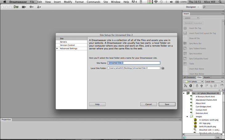
So I can name my website, and also select the root folder of where I will keep all the images and css styles.

Then I go to File> new:dreamweaver, SEO, image optimisation, save for web, website, design, logo, branding, navigation, photographer, photography, Alice, Volk,   I select: Black page> HTML> layout> create. This is the standard new page, but I am going to use the CSS file provided from Phil so that my website has a wrapper.

I have started putting items in and I want every page to look the same except for the images or text (content). So once I have moved everything around and inserted my logo, navigation, social media icons (with links attached), now my page looks like this:dreamweaver, SEO, image optimisation, save for web, website, design, logo, branding, navigation, photographer, photography, Alice, Volk,  So now I want to create all my pages using this page as the base for them all, so I firstly ‘save’ my index (home) page, then ‘save as’ to save more pages identical but naming them accordingly. I save them all into my root folder. Now that all my pages exist, I need to link them all to each other so that when I click on the navigation or logo I get taken to the correct page.

dreamweaver, SEO, image optimisation, save for web, website, design, logo, branding, navigation, photographer, photography, Alice, Volk,  
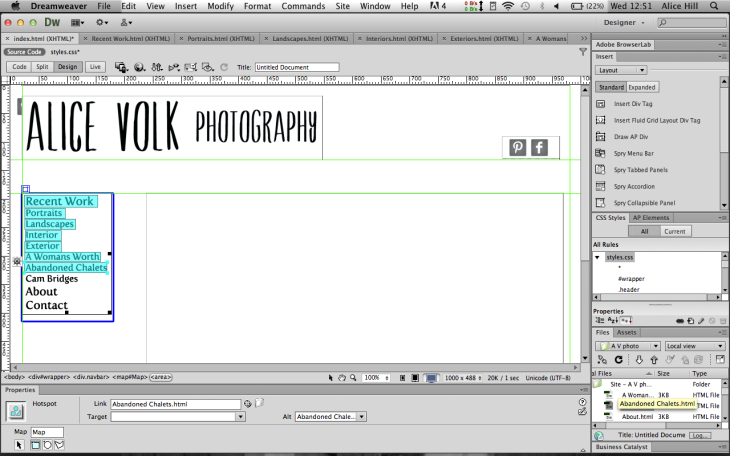
I do this by selecting the navigation (or header, or social media icons) then go to Properties at the bottom and select ‘rectangle hotspot tool’ to create a hotspot. Then using the tool I select an area, for example ‘recent work’  then I make a link in the Properties and drag it to point at the ‘recent work’ page in my files in the bottom right hand corner. I then repeat this to highlight (in turquoise) each area I want to link. It can be linked either to a page in my files OR I can enter a web address off site which is what I have done for my social media.

dreamweaver, SEO, image optimisation, save for web, website, design, logo, branding, navigation, photographer, photography, Alice, Volk,  Now I am going to name my website as this will appear on it, so in the Title box it currently says ‘untitled document’ and I write ‘Alice Volk Photography’.

Next I want to start adding in all my images and information onto each page. So starting with my home page I view all my ‘saved for web’ files into my ‘Files’ and I place the cursor in the ‘main content’ box then drag the selected image into it. Now it is there:dreamweaver, SEO, image optimisation, save for web, website, design, logo, branding, navigation, photographer, photography, Alice, Volk,  I want all my images to be titled, so I then add the title of the image below it. I do this with each image I want, onto each page until all my image galleries are full of photographs and titles.

Now one thing that I have changed on the original site I got from Moodle is the ‘footer’ where I will place my © Alice Volk at the bottom of each page. I have had to delete the original one because all of my pages are different lengths because I have vertical image galleries. So I need to make a new ‘footer’ than sits at the bottom of each page that sits outside of the wrapper. To do this I insert ‘draw AP Div’ and draw it out, then I add in my text. Then while the ‘footer’ is still highlighted I go to ‘Code’ and the code for the NEW footer is highlighted already, so I ‘cut’ it then paste it into here:dreamweaver, SEO, image optimisation, save for web, website, design, logo, branding, navigation, photographer, photography, Alice, Volk,  So that the highlighted text is below the </div> and above the other </div>. I do this insert new div (footer) for each page at the bottom, so now I am ready to brow my index page in Safari, it looks like this:dreamweaver, SEO, image optimisation, save for web, website, design, logo, branding, navigation, photographer, photography, Alice, Volk,

Now that I am viewing it in Safari I can check everything works. And it DOES!

Please check for yourself

www.avphoto.co.uk

Logo Design, Navigation Typeface & Branding

I have finally decided on the font for my logo, I feel it is such an important part of this task as it is going to set my branding for myself as a photographer and my business potentially for the rest of my life, so after some careful consideration I have chosen one, here are the 3 finals:design logo branding web design font typeface

design logo branding web design font typeface design logo branding web design font typeface The first example was my original choice because it is the most plain of the handwritten styles. But I felt that it was too plain. The second example although I like it a lot I felt that it was to ‘cartoony’ and does not fit the style that I want to create for myself. The third example is my final logo design.

Why have I chosen a hand written typeface? I have chosen a handwritten typeface for my logo for a few reasons. I feel that my logo must be exactly what I want it to be to represent me, as a business/free lance photographer. And after looking through many different fonts and styles all the ones that stood out to me where handwritten ones and so after narrowing them all down I have chosen this one. Every letter is easy to read, and unlike the first example I particularly like the way the font is different thinknesses depending on if the stroke is horizontal or vertical. I feel that this handwritten stlye of font suits me because my photographic work is mostly fine art photography and that this suits this genre perfectly. I did not want any illustrations or symbols to show that i am a photographer (like a little camera icon) so I have chosen the word ‘photography’ as it is then explained exactly what I do.

To make my logo design so that it can be used over and over again and easily dropped on to another design such as a business card or similar I have made my logo a transparency at 300dpi. This is a large size because it means that I can always resize it to fit a small space and I know it will be good enough resolution for anything else I will need to use it for in the future.

design logo branding web design font typeface

Now once I have designed the logo the next most important design choice is choosing a typeface for my naviagation bar that suits the logo and feel of the website. Below is a example of what I have chosen, please note that the size’s of the words are not to scale of what will be used in the final website design.

design logo branding web design font typeface

I searched through many, many different fonts to find one for the navigation, and although i liked a lot of them this task was about finding one that went with my logo. This means it couldn’t detract from the logo, e.g. be more eye catching. I knew I wanted something simple and very easy to read, but I wanted something a little more detailed that regular styles such as Times, Ariel, Georgia, Veranda etc. So I have decided on this one called Fertigo Pro. I am very happy with it as its super easy to read and also having done some tests I know it works well to be used as above, in lowercase but also in all capitol letters. To keep consistency throughout my website I will be using this typeface for the titles of my photographs.

The example below shows my website at its current stage in Photoshop design, I have entered all the elements that I am going to include, this is the home page. I have also added my social media icons, as these are vital to stay linked up with many different websites and to stay connected to the WWW. I have chosen a simple grey as i felt that any colour would draw attention away from my photograph/hero image.

design logo branding web design font typeface photoshop landscape photography

So far I am very happy with my website designs and my next step is to locate all my photographs that I want on my website. Please note that the only thing about this example that is currently incorrect is the navigation, I have put ‘project 1’ & ‘project 2’ as a example but really it will have the title of a project that I will have included for example ‘abandoned chalets’. So I am going to decide upon which projects and photographs to use, and what genre or project they are in, then I can complete the navigation with the correct words. Then I am going to save all the photographs for web in Photoshop so that they are all of a correct size to use.

Navigation Inspiration


I am quite clear in my mind as what sort of navigation will look like, it will go down the left hand side of the page, here are some examples of other websites I have found that have inspired me and show what I like:navigation bar design logo branding web design font typeface This navigation is from http://www.matthias-heiderich.de

He is a photographer and the navigation, although the list is long is just many different projects of his work, then at the very bottom of the list under a gap is ‘home’ and ‘contact’, which I feel is too far down out of the way. I also think the choice of colours, gray on gray is not clear enough to read, especially with such a small size font. Although there are a few things that don’t work well in my opinion I like the list of different projects that can be clicked on easily from any where you are on the website.


navigation bar design logo branding web design font typefaceThis is from http://www.timwalkerphotography.com

Again like before this navigation has used a grey colour for the text but this time it has been divided up with lines, also it is all in capitols which I think works well as its easy to read. Another thing is that when you have clicked on what you want to go to, the text goes black, here I have chosen ‘portraits’. In this example the choice of the photographers projects (recent work, portraits and archive images’ then below that is news, biography, contact etc. I like this a lot more than the gap between them shown above as the viewer looks down the navigation and its all there and easy to see and choose where they want to go on the website. The two fonts chosen here between the logo at the top and the navigation are similar, but not the same, this has some consistency in the website.


navigation bar design logo branding web design font typefaceThis is from http://www.johannalaskey.com

Although you can’t see it all, after the logo of her name there is her occupation separated with //. As for the navigation she has used a black and white like I plan to so not murky grey’s, but she has used different size fonts and bold to show the different areas of navigation broken up. You cannot click on the ‘work’ or ‘about’ headings they are just headings, I find it strange she does not have a ‘about’ page as there is no information about her at all, just the blog and contact details. I like the way the navigation has headings to separate the areas of the website and also that everything is in capitols, I find this easier to read and think I will do the same.

I am going to try some different looks for mine with and without headings and depending on what font I decide on will determine if I do it all in capitals or not. Now I just need to find a font that works well with my logo!

Wire Frame for my website

I have made a wire frame for each individual page for my website. I am planning to have 4 pages; Index (home), Gallery (with different projects and genres), Info (my CV and mini biog), and Contact (email, phone etc). The wireframe allows me to map out the areas of each section of each page so that when I come to the design to take to Dreamweaver I know exactly where everything is going to go. Please note that my website will not be green, this is just to show the areas divided up clearly.

Index Page:wire frame logo design photography photographer website design header footer gallery

Gallery Page:wire frame logo design photography photographer website design header footer gallery

Info Page:wire frame logo design photography photographer website design header footer gallery

Contact Page:wire frame logo design photography photographer website design header footer gallery

I have chosen a simple header and footer with the navigation down the left hand side of the page. I feel that the navigation down the side works well rather than across the top for the kind of website I want. This means that there is a large area to place photographs in directly below the logo. I feel that it is easier to read each option going down, rather than the  words separated with a | divide. I am now going to do a list of  all of the SEO words that are relevant for each area so that I can then easily refer back to them when I am building the website in Dreamweaver. The SEO words are vital as they are what makes a website ‘found’ in search engines on the web.

To get a idea of what other photographers have used in their website, here is an example I took from a website:wire frame logo design photography photographer website design header footer gallery

Title: Alice Volk Photography

Description: Contemporary photographer working in and around the south east. REVISE

Key Words:

Alice Volk, Alice, Volk, Photographer, photography, image gallery, Brighton, Sussex, Based, Landscape, landscapes, portraits, Portrait, interior, interiors, contemporary, professional, fine art, fine, art, personal, work, current, REVISE

Image: (different depending on each image)

Refined fonts for my Logo

photographer photography moodboard logo design font typeface

This is a mood board of my refined choices of possible fonts to use for my logo. I am having a lot of difficulty deciding on which one to use! These 5 are the possibilities that I am considering. I am drawn towards ‘strange love’ but then I feel it is quite thin and that one of the three on the right column would be easier to read from a distance as they all are quite thick. I will give it some thought ….