My three final website interface designs for my fictitcious exhibition called ‘The Lost Photographs of Circle R Ranch’
Texture:
Vector
Web 2.0


My three final website interface designs for my fictitcious exhibition called ‘The Lost Photographs of Circle R Ranch’
Texture:
Vector
Web 2.0
In no particular order, here are my final 9 photographs for the exhibition, to see the before and after please refer to previous posts


I am going to do my final interface design incorporating the Web 2.0 style design and use. Web 2.0 is not a style but a website that is more interactive than a static page. It is also a term used for online communities online. But baring all this in mind there are some common themes of interface design that are used in Web 2.0 such as rounded corners, gradients, reflections, letterpress, a lot of empty space, user friendly, easy to read big type using a rounded font such as Sans serif, big logo and also it must be simplistic. So baring all this in mind I am going to draw out the wire frame first.
Wire Framing
For the wire frame I have included only the completely nessesary elements in the web page, this is in aid of keeping the design as simple and easy to use as possible (user friendly). 
I have also kept the design symmetrical as I think that this makes it easier to read for the viewer. Because online communities are so important for social networking online the social media icons are very important in the design of Web 2.0 and must be placed somewhere obvious to the viewer.
Interface Design
Starting with the background and working outwards/upwards I am going to make a gradient, see the screen shot below
The gradient tool allows you to make a colour blend with another colour, or get lighter or darker. As rule of thumb I have made my background 1600 x 1000 pixels, then to get a understanding of the main body area I have made a rectangle that is 960 x 760 pixels. I make this box white and turn the opacity down to just around 10%, this means I can see it, but it has not altered my colour choice much.
I have decided that this Web 2.0 style of design does not really work very well in my mind for the theme behind my edited images. When designing the previous two interface designs I felt I could get the right kind of website style to suit my photographs and the branding for my exhibition, but this Web 2.0 is not the right style. So any way, I have to do it, so I am going to attempt to make it fit the Web 2.0 even if it does not show my images off well. I am going to include a image as well as a photograph. I have found this lovely drawing which I think will set the tone of my

Western theme website off quite well. This copy is hand drawn, so I am going to alter it in Illustrator the same way I altered a photograph into a vector image before.
So I took this drawing into Illustrator and made it into a 3 colour image. But I felt that this was still too detailed and I wanted just a silhouette of the horse and man, so I did this, then pressing ‘expand’ to make sure it would be easy to resize big or small when I took it into Photoshop.
So I took it into Photoshop and started designing the header, the logo. This was tricky because the style of Web 2.0 fonts which i typically a San serif was not a Western themed novelty that I had used before so I searched and found one that I feel works well for Web 2.0, called Lobster, although it is a little fancy it is curved but still very easy to read which is what I want for the interface style. See screen shot below
For my vector image I have chosen a off-black, as I feel that black is does not fit in with the Web 2.0 colourful pastel style. I have done my logo with the font Lobster and included a gradient in that a well, using s thin stroke to bring out the letters from the background subtly. I have also used a rounded rectangle box for the logo to go on top of. I have used the ‘FX’ options to alter the text and the box and make them Web 2.0 using the tools like gradients, inner glow and stroke.
Now still working on the hero image area I am going to add in a photograph of mine, but instead of making it the centre feature and only image I am going to make it into a link to the gallery as this is the most important part of the website. Here is the link to the gallery:
So to create this banner I have used the rectangle shape too and used the ‘other shape’ options. This gave me a huge range of options for random shapes and I felt that this banner works quite well laid over my image, it is also big enough to make it quite obvious as this is what I want it to be because the gallery will show all my exhibition photographs.
Lastly I have done the footer which includes the © Alice Volk 2012 copyright and also the very important for Web 2.0 social media links. For this interface I have made them slightly bigger than in other designs as they are a important part of the online community and networking that promotes Web 2.0. Below is my final interface As I mentioned already, I felt that Web 2.0 was not going to promote my photographs the best of all 3 different interface styles I have done, so I decided to keep it as simple as possible. I have used simple two main colours and quite pastely ones with darker text colours for the navigation and gallery link on the banner so bring them out and prominent from the coloured background. I’m not sure if its web 2.0 or not but I am happy with my vector image of the horse and cowboy because I feel that it speaks as part of my branding for the website.
I am going to make a brush from a area of a texture in Photoshop. This is most useful because it is saved into my brush’s and can be used again and again.
So first I open a image or texture (or anything ) in Photoshop, then using the lasso tool I draw around a area I want to make into the brush. Then I go to Edit> Define Brush Preset, then this appears: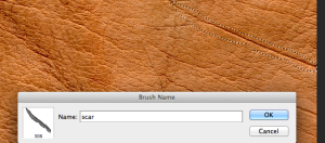 So Photoshop lets me name the brush, so I click OK.
It is now ready to be used, so I use the brush tool and it is at the bottom of my brushes ready to be used!
IMAGE 6, 7, 8 & 9
For the last four images I have included in my exhibition the editing process was the same or very similar to the Photoshop techniques I have already used and explained in the previous posts. So I am not going to reexplain what I did. The only differences is that the layer blend’s are different.
In this post I am including the before and after images for comparison and a small summary of each of the ‘after’ images to what I was aiming to create.
IMAGE 6
Before
For this image I added in a murky effect which is more visible in the top right hand corner. I have also used brushes to add in the defects along the top edge. This is to give the photograph and old and worn out vintage photograph effect.
I have also bleached out the bottom and darkened the top as this makes it appear it was taken on a very old camera.
After
IMAGE 7
Before

This photograph I have added in some obvious light leeks which is a something that can happen with film, either the camera is broken and lets in light, or you expose the unprocessed film to the light in some way, or alternatively it could be a defect on a negative which is very old because negatives and photographic prints fade and dull over time, especially around the edges, this happens when they are not looked after properly and over years and years the suns light fades the details.
So that is what I have tried to mimic in the editing process for the photograph below, I feel that it looks quite realistic because the fading is not equal all over the photograph. After:

IMAGE 8
Before
This image I wanted to do the same effect I have used on one of the previous photographs, to over and under areas of the image giving it a completely different exposures. Also I added in some scratches using the brush tool, and also the pencil tool which makes a really sharp scratch which I feel looks very effective and realistic. After:

IMAGE 9
Before
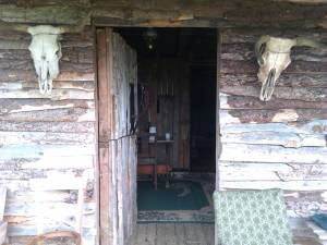
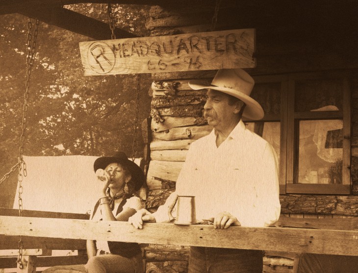
 So this is my last image, it is landscape, all the others are portrait. As you can see from the original photo on the left, there is a Bedweiser can on the fence. NOT OK!! So I cropped the image to frame just the two people in it and leave out the Bud can. As I have done before on some others, I have bleached out the white on the mans shirt to make it appear it was taken on a less modern camera. In this particularly large image below the film grain (that I have applied to all digital photographs for the project) can be seen clearly, this is very authentic looking I feel. After:
So overall I am VERY happy with the outcome of my work from this project. As a photographer it is normal to use Photoshop to edit images so that they are enhanced to be better, but for this project I found myself adding elements into the image to make it look worse, like stains, scratches, loss of detail, over/under exposure etc. But saying that, it has been more enjoyable than what I usually do because in some cases I was making the photographs look as extreme as possible, but then also in other photographs I was adding subtle differences, so the extremes were fun.
I have enjoyed it also because I have learnt A LOT of new skills in Photoshop and Illustrator that I didn’t even know existed, such as layer blends, adding texture though layer blends, downloading brushes from the internet, designing brushes to use, actions that can be downloaded, well the list goes on! I feel that what I have done suits the content of the images profusely, so because they are modern I have made them suit the style to what is in the content. I hope that if someone saw one they would believe it was old as I have tried to leave out any modern items from any of them, which when I was selecting my images I had to do carefully because although the backdrop of the landscape, horses, bunk house, hanging tree there was often a mobile phone in someones hand, or a modern piece of clothing (not everyone who goes here dresses as traditionally as the two in this portrait ) like a puff jacket, or a Budweiser can etc …! So now I have finished editing them I can put them into my fictitious exhibition!!
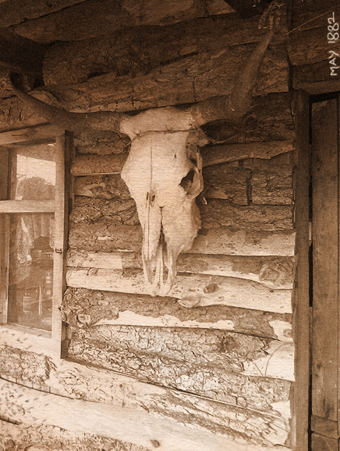
IMAGE 5
This image is of a dog outside the bunk house. Because the dog it in the centre of the image I am going to make him a feature of the photograph by doing a vignette frame. Here is the image before I edited it

The dog sits happily in front of the bunk house on a sunny day. The horses field is behind the dog, but you can’t see any horses making the dog the feature of the photograph.
I am going to make the editing on this photograph much more apparent than any of the others so far. The cameras used in 1880’s were a lot different to ones we use now and getting even the basic correct exposure was difficult, along with then developing the slide film correctly to the minute, which if done wrong would result in a under or over exposed photograph. It is common to see very old photos that are not correctly exposed for this reason so I am going to make this one underexposed, as well as a vignette frame using the dodge and burn tool. I also add film grain filter like I have done for all of the photographs previously.
Colour to Sepia Tone
So there are many ways to convert a colour image to black and white, but this one I am going to make a sepia tone. As I mentioned before I don’t want to use the Actions for creating the sepia tone every time as I feel that they will look to samey, so I am going to do it myself, this gives me much more control to exactly what tone of orange/yellow I want. 
So in this screen shot is the sepia tone applied to my photograph. I have done this by going to Layer> New adjustment layer> Colour Balance, then this box comes up. Making sure I am only altering the mid tones in the ‘Tone’ drop down box, I then slide the top bar towards red and the bottom bar towards yellow. I can nudge these until I am happy with the sepia tone. I am only changing the mid tones because when you add sepia to a photograph in the darkroom, only the mid tones are affected. Only the bright white and black stays the same. You can see in the screen shot the in the sky the part just above the trees is still white, it is burnt out, this is unaffected by the colour balance, but above that burnt out strip is some detail in the sky, clouds, this has taken some of the sepia tone.
Layer Blending is what I do finally to the image, I have chosen quite a dramatic scratched and old looking texture, then applied a layer blend, as I have done in the posts before this. Below is my before and after photographs
 I have used a very abrasive texture for this photograph, also I have made it quite dark. The reasons for the under exposed-ness of it is mentioned above, but I thought I would add to this more by adding in the scratches making it appear like it has been manhandled many times over the 100+ years since it was taken. I am happy with it because it stands out from the rest of my photographs because it is so dramatically different. I even added in at the end the splodge of liquid in the top right hand corner to resemble a spillage of chemicals in the darkroom or coffee.
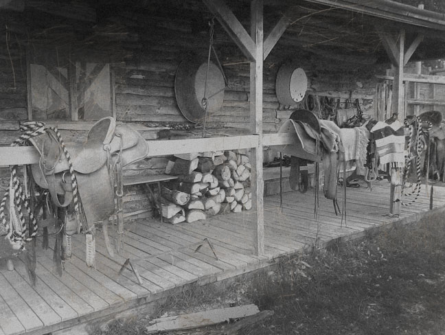
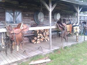
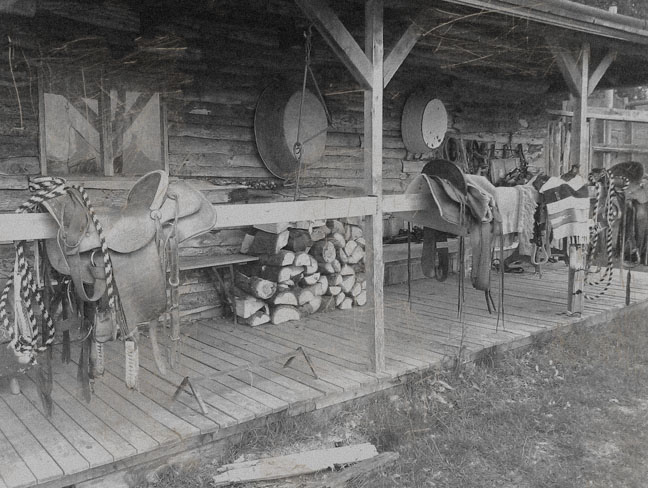
IMAGE 4
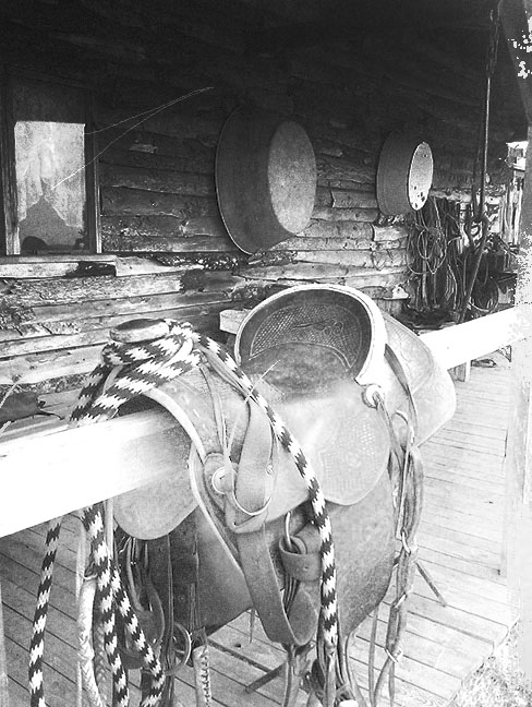
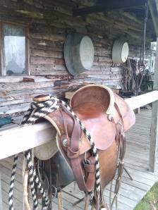
This image is off the porch of the bunk house. It is a simple shot but includes some of the beautiful leather work done on the saddles so I have included it in my exhibition.
Before
 The editing of this image I have made it black and white, added film grain but this time I am going to use a filter from a set of filters made for Photoshop. They are all different from each other, and what is better about these filters compared to regular filters on Photoshop is that they come in a program that opens in Photoshop. So in the program you have many many options to choose from while you are adding the filter, such as …///////
The program and filters are called Machine Wash and are made by Mister Retro, so from the name you can tell that he designs filters to add to photos to make them look old/aged/vintage/worn/retro etc. Have a look at his fantastic website here. And the Machine Wash effects examples here. He does a lot of design work, posters, vector art, apps, as well as Photoshop filters. He also does what he calls ‘permanent press’, stating “Realizing that printing technology has left printed work without the texture, soul, or the spirit of vintage printing, Mister Retro created Permanent Press!”. Have a look at the examples of what these filters do here. Personally I think that his site design is amazing, it fits in perfectly to what he is selling, plus his filters are designed thoroughly. See the program and all of its options below in my examples when I use it.
Machine Wash Filters
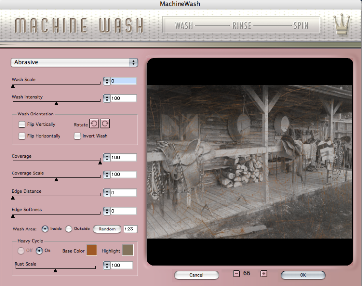
This is a screen shot of the Machine Wash window that comes up when I use it. Filters>Machine Wash> Machine Wash No1. There are about 100 different filters on Machine Wash, I have included this picture to show the amount of different options it gives you when applying the filter. It allows you to choose the ‘wash scale’ and ‘wash intensity’. It also gives the Preview on the right so you can see what you have selected looks like immediately. So from this example shown you can see my image is black and white but the filter I have chosen (scratches) is showing as brown, so I have changed the Base Colour and Highlight colour to pale grays so that the filters colours match my black and white photograph. It also has the option to rotate the filter which is very useful.
So I could have used these filters for all or some of my photo editing, but I haven’t because I feel it is more effective to do things buy hand, such as brushes, scratches and layer blends. I have added in this one as I feel that the ‘scratched’ filter works well for my project.
After Machine Wash had done its thing I felt that the photograph didn’t have enough contrast, so I used the dodge and burn tool, as I have done in previous editing on the photos for this exhibition, but this time I found out something new. I realised because I already had the Brushes box up that these options were also available to use whilst using the dodge and burn tool, giving a much softer result as dodge and burn doesn’t add a colour but just lightens or darkens. So below is the brushes palette open, to control the size of the brush, bigger or smaller I use the keys [ and ]. See screen shot below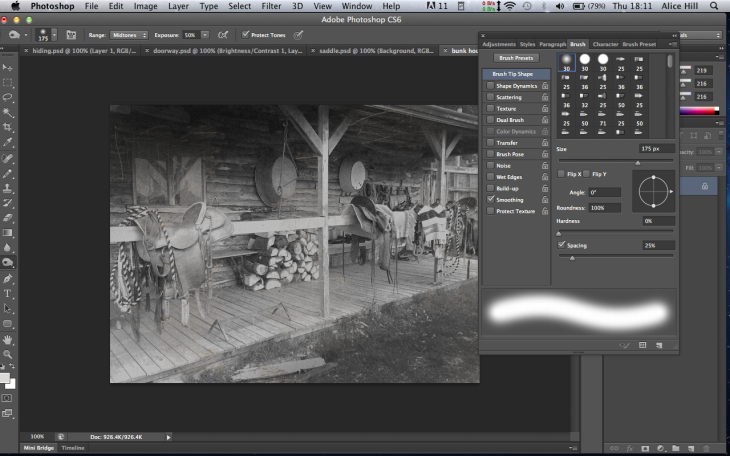 So here I have only added in a little more contrast, darker to the top shadows and lighter to the middle where the saddles and porch is.
Here is my before and after below it
I am happy with this photograph, I think that the Machine Wash filters are really good and easy to use, also because you have so much more control over the effect it will do to your image, so you can go over the top or just add a subtle difference. Its good to know whats out there on the internet and although a lot of textures and filters are free, Machine Wash doesn’t come cheap, but this is worthwhile because of the amount of control it offers you whilst working.
I am going to design a second website interface for my fictitious exhibition ‘The Lost Photographs of Circle R Ranch’ but this time using the vector style of design. Having already designed a header previously to this I am confident to try the whole interface now.
Wire Framing
I start off with 1600 x 1000 pixels as this is going to be large enough for the background, then inside this I mark off the main body. The main body will be the right size for a standard size screen, this is 960 x 760 pixels. Here is my wire frame: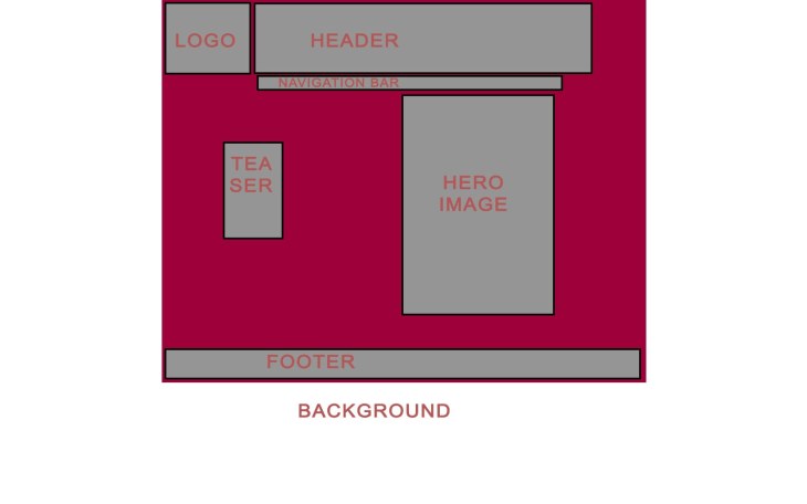
I have introduced a ‘teaser’ into this design as I want to make a special feature with a link to the gallery of my photographs. I feel that because this website is ALL about my exhibition and nothing else, so adding extra emphasis onto taking the viewer to the gallery is important.
Interface Design
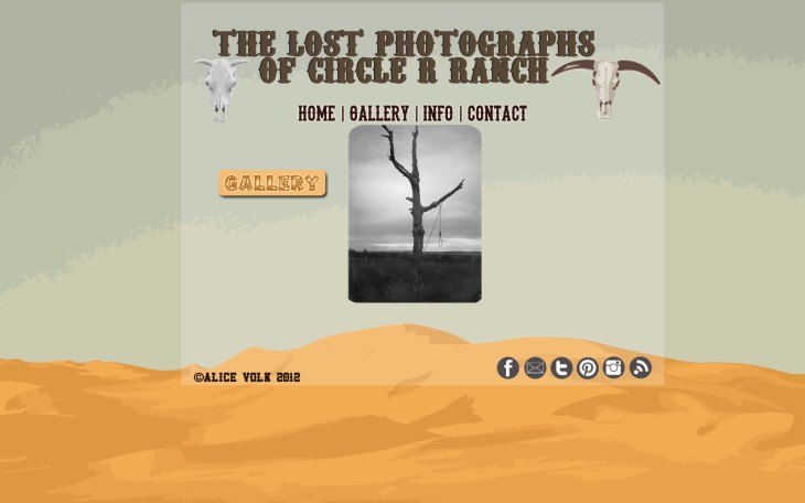
I have a clear idea in my mind what I want the background for my interface to look like, so using Google image search (2MP+) I search for a desert landscape. The sandy and dry horizon is what I want to use as my background. I then use Illustrator to open the photograph I chose and turn it into a vector graphic. I did this the same way as I have described in my blog post Vector Image Workshop – Creating a Octopus and Header, please see that for instructions on how to transform a photograph into a vector image. So in Photoshop I open the file and resize it to around the size of my document, I have made it bigger because personally I think that the vector image is too big and I only want to include some of it as my background.
So now I have positioned the background vector image into the place I want I have now added in a rectangle using the ‘rectangle’ tool. I have filled it with white and reduced the opacity to 10%. I have drawn the box as exactly 960 x 760 pixels because this is going to be the main body of the interface and when I start to add in other elements such as header and footer I want to know where the main body is exactly, also aesthetically I find it works well to highlight the most important area I will be designing. I have put it in ONLY for design purposes, I will remove it later on.
Next I am going to design the header which includes the name of the exhibition, branding and logo. To me this is the most important part of the whole interface design as it allows the style to come through. Having found a number of Western cowboy themed fonts at dafont.com I decided on Carnivalee Freakshow because I found all the others were to modern or too fancy, I wanted a more traditional font. 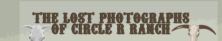
I added a slight shadow to bring the words out of the background. I wanted to use some little pictures as part of the logo as I feel that they are significant to my Western cowboy desert theme. I made them both in Illustrator the same way I changed the background from a photo into a vector image.
So this screen shot above shows the lower part of my interface, I have added the navigation bar using another Western themed font and used a ‘outer glow’ in the FX to illuminate it. I have also added the brown rectangle as a semipermanent area for where my hero image will go, as I plan to add this in later on and want to see how the other elements fit around it. Then I started on adding in the information into the footer such as copyright and my name and the year.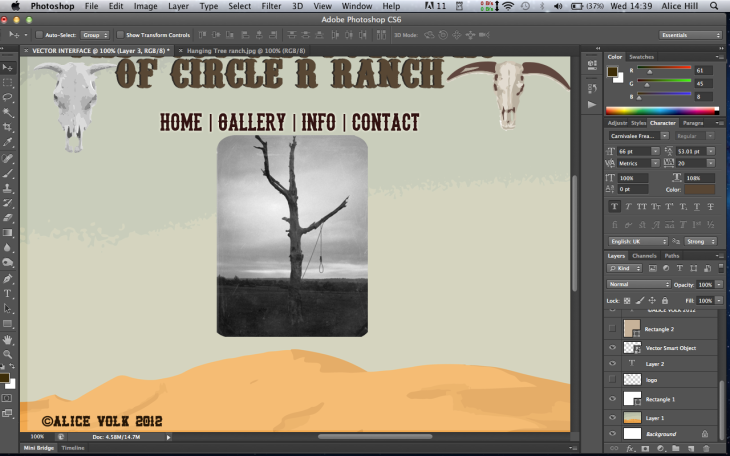
Now I am adding in my hero image. I have used my photograph of the hanging tree as I think the rounded corners work well with the vector background’s hills. Now I am going to add in a ‘teaser’ to take my view directly to the gallery of photographs. Here is the teaser:
I have done it the same colour as part of the desert landscape from the background to keep the colour theme consistent for the whole interface design, then using the FX I have added a faint drop shadow. I have used a font that resembles wood as I feel that this is significant to the tree in the photograph. So lastly I add in the social media icons (reluctantly because I feel that they completely destroy what I have designed as they are modern and always have the same little icons, adding a instantly recognisable distraction for my viewer, away from what I have put into the site). Here is the final interface: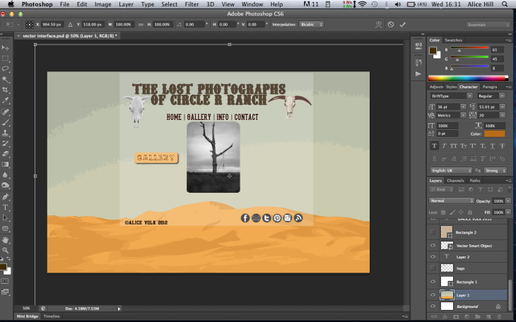
This last screen shot shows the (almost) finished interface. I chose social media icons in colour that I feel are dull and also fit in with the colour scheme of my website. If you look closely I am in the background vector image layer (in the layers box) and I have pressed CMD T (transform), this then highlights around the edge of the vector image which you can see has a white line showing where it is. I have specifically left the vector background image too big as I wanted to be able to move it around at the end, now. The horizon in the background is really important to where it is placed, I either wanted it quite high, making the green sky become a banner/section for the logo, or I wanted to have the horizon quite low, this would mark off the yellow desert as a footer. So as you can see I have chosen the horizon to go along the bottom of the page. This is because I feel that having that much yellow in the design became quite garish and so I felt that the green sky worked better.

I am happy with my final vector interface design, I feel that the colours work well together and fit with the vector theme. I have done a almost symmetrical design, although it is not completely symmetrical the logo, navigation bar, hero image all go downwards getting thinner, then I added the teaser which breaks this up. I feel that the teaser is very important for this design as the ‘gallery’ in the navigation bar can easily get slightly overlooked as it fits in with all the other options, so having the teaser is a way of getting the viewer to look at it (using a bright colour) and click on it. Also I feel I have done it well with a Western font so it fits in with my design. So far, this is my favourite interface design!
I am going to make my final three interface designs, starting with the theme of using ‘texture’ in the design.
I have been thinking about what textures I want to incorporate into the design as I feel that the textures must relevant to what my fictitious exhibition is of, so because all my photos were taken at the ranch there are some textures that will work really well such as, wood grain, sand, leather and (old) paper. Before I start any of the design I am going to draw out the wire frame so I can plan where everything will be located.
Wire Framing
Here is a plan of the wire frame, I have blocked out the areas for the interface design so that I can assess what works and what doesn’t and move the areas around until I am happy with a effective layout.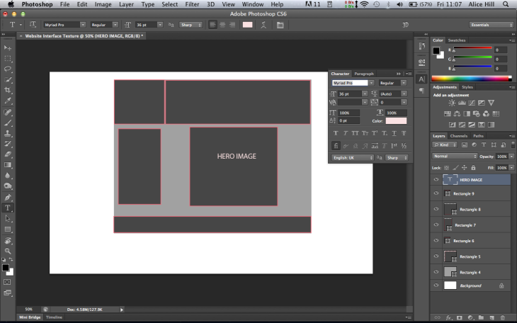 I have used the ‘rectangle’ tool to mark off each area, then used the ‘text’ tool to label each one. Here is the final wire frame:
 To start off I created my interface as the dimensions 1600×1000 pixels for the whole canvas, this is because the interface needs to fill any size screen, even the large screens (although I don’t use one) so that there is always some ‘background’. Here the background is white, then inside of that I made the main body which is in light grey 960×760 pixels. The main body is this size because that is the standard size for a computer screen, I don’t want to it be longer or wider because other wise the viewer would have to be scrolling up, down, left or right to be able to view the whole interface, I don’t want this because its not appropriate for the viewing of a home page.
Interface Design
So now that I have marked off each area I am going to work OVER it in Photoshop, so I bring in a background image and ‘hide’ the layers that I don’t want to see at this time. For example in the screen shot below, I first of all hid the wire framing layers so that I could work on the background design, then I ‘unhid’ the layers to get a idea of what it will look like when I have added the rest of the areas.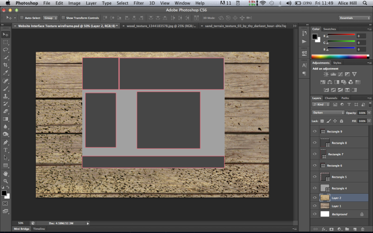 For the background I used a two images, one of the wood grain, and the other is off some dirt/sand. I then used a ‘Layer Blend’ between them to get what is in the screen shot above. I chose the one ‘Darken’ because I wanted the wood the stay more prominent and the dirt/sand layer to add some more texture on top of the wood.
Now I am happy with the background I am going to add in the ‘main body’ area with another texture. For me the wood is going to stay the main texture of the whole website so for the main body I am going to add something quite subtle that just differentiates the main body slightly from the background. I chose a texture of a old folded up piece of paper, this is what it looks like: (I have hidden the wire framing layers also) So this screen shot shows the ‘main body’ as the piece of paper over the background, but I want to use another Layer Blend so that the main body becomes part of the background, this will create more texture on top of the background to show the where main body differentiates from it. I have chosen the Layer blend ‘soft light’, see my final interface design below to see what it looks like!
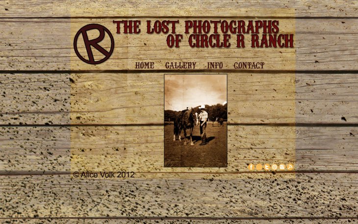
Now I am going to design what I think is the most important part, the Header and the logo, combined these two elements help to create some branding and also some character to the websites style/theme. The font used in the logo is what allows this to come through. Because my website is about a Western cowboy themed exhibition I have chosen a very Western font as this truly suits the interface design that I am trying to achieve. Below is a screen shot of the header and logo: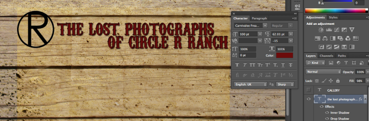 So this screen shot was taken when it is not finished..! The logo (letter ‘R’) I made in Photoshop separately to this file so that it is transparent and therefore shows the background underneath it. I have done this because it is meant to symbolise the branding iron that is used to identify animals on a farm or ranch. For the writing I have used a font that I downloaded from dafont.com. This website has a huge selection of Western themed fonts to download. I have used one called Carnivalee Freakshow and chosen a rustic deep maroon red as I feel this adds to the theme well. I have then used the FX to add more detail and 3D-ness to the text to make it stand out and have depth. I have added: inner shadow and a drop shadow, although it is quite a small image here please see my final image for a better look. I used the character palette to move the text nearer as I wanted the top line and bottom line to be almost touching. I am very happy with my logo and branding as well as the background for the Western theme.
Next I add in a navigation bar, I only have a primary navigation bar as I only have a few different options because it is quite a simple site and I am not trying to sell anything or advertise anything. For this I chose a similar but different font to the logo, also when designing I decided to change the location of it. As showed in my wire frame it was on the left of the hero image, but I decided it looked best just above the hero image instead.
Next I added the hero image, I chose this one from the project as I feel it is one of the better images, also it is a portrait not landscape which makes people respond to it more.
Then lastly in the footer I add in my name and ‘copyright’ symbol in one corner and also some social media icons in the other corner.
Here is my final interface design below I am very happy with the final result of this design. At first I thought the idea of having a whole website based around textures as I felt it would be ‘too much’. But then having thought about the images I am using for the fictitious exhibition I then thought about what textures would really suit what the exhibition is about and then in my mind it all started to come together. I want my interface design to be very clear and none of the textures to take over from the images, for example the textures layered up with all the elements could look messy or cluttered. The last thing I did to the design was add a simple thin black border around my hero image as it needed some definition from the background as a lot of the colours that I have used are quite similar, but this is because I think that they add towards the Western theme, browns like wood and pale yellows like sand. I have also used this colour theme in the social media icons, as although usually they all have their own distinctive colours (which is part of their easily distinguished branding) I thought having blue or red or bright colours would really destroy the design I have done and become very eye catching to the viewer as they would really stand out against the rest, so I chose a yellow for the social media icons to make sure they fitted in with my sandy theme.
I am doing a post of all the different ways to change a colour image into black and white because there are so many, and it is important to know which one to use for which image, and why. I am using Photoshop CS6 but I think that all the ways I mention are the same on all the creative suites. Using a simple image I will put a example of the different results at the end of the post for comparison. The results may not appear that different from each other because when viewed on the web the image resolution is 72dpi, but as a photographer I work at 300dpi when editing photographs, so working in much more detail than what can be seen on a computer screen, so what you see on here is not as accurate as my images at 300dpi when printed.
1)Image> adjustments> Desaturate
2)Image> Mode> Grayscale
3)Image > adjustments> Channel Mixer> Monochrome OR to do the same in a new layer Layer> New adjustment layer> Channel Mixer> Monochrome.
4) Image> Adjustments> Hue/Saturation> take the saturation all the way to the left. This can be done in a new layer in Layer>New Adjustment Layer> Hue/Saturation….take down the saturation.
5)Image> Adjustments> B&W or to do this in a new layer: Layer> New Adjustment Layer> B&W
more info to come…


