Making a brush in Photoshop

I am going to make a brush from a area of a texture in Photoshop. This is most useful because it is saved into my brush’s and can be used again and again.

So first I open a image or texture (or anything ) in Photoshop, then using the lasso tool I draw around a area I want to make into the brush. Then I go to Edit> Define Brush Preset, then this appears:making a brush in photoshop
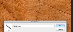
So Photoshop lets me name the brush, so I click OK.

It is now ready to be used, so I use the brush tool and it is at the bottom of my brushes ready to be used!

Digital Image Manipulation – Colour to Black & White in Photoshop CS6

I am doing a post of all the different ways to change a colour image into black and white because there are so many, and it is important to know which one to use for which image, and why. I am using Photoshop CS6 but I think that all the ways I mention are the same on all the creative suites. Using a simple image I will put a example of the different results at the end of the post for comparison. The results may not appear that different from each other because when viewed on the web the image resolution is 72dpi, but as a photographer I work at 300dpi when editing photographs, so working in much more detail than what can be seen on a computer screen, so what you see on here is not as accurate as my images at 300dpi when printed.

1)Image> adjustments> Desaturate

2)Image> Mode> Grayscale

3)Image > adjustments> Channel Mixer> Monochrome OR to do the same in a new layer Layer> New adjustment layer> Channel Mixer> Monochrome.

4) Image> Adjustments> Hue/Saturation> take the saturation all the way to the left. This can be done in a new layer in Layer>New Adjustment Layer> Hue/Saturation….take down the saturation.

5)Image> Adjustments> B&W or to do this in a new layer: Layer> New Adjustment Layer> B&W

more info to come…

Web 2.0 Workshop – creating a logo

I am going to create a logo for ‘photocube’ using Photoshop. I am going to create it in the style of Web 2.0 and experiment using the various styles and rich surfaces and the letterpress effect.

To get a Web 2.0 name ‘photocube’ I went to www.dotomator.com which is a online name generator that allows you to choose what type of words to work with. To get ‘photocube’ I chose the word ‘photo’ and then selected ‘web 2.0’ then ‘combine’.

In Photoshop I go to File> new> 900×700 pixels 72dpi RGB. As in previous workshops I have used the character pallet to choose a font and size of the text, also to increase the tracking. Here is my first one:web 2.0 logo designThis screen shot shows how to create a gradient on the text layer. After choosing the font and size, altering the tracking so that the letters are closer together I go to ‘FX’ > Gradient Overlay. This is the box on the far right ‘Layer Style’ which has got all the options down the left side. Clicking on the ‘Gradient’ drop down the ‘Gradient Editor’ box comes up, which is seen in the screen shot with all the options. I have chosen the top left gradient, which is quite simply ‘darker to lighter’. In the same box the ‘Gradient Type’ has a box of colour, to get this blue that I chose I double clicked on the far left hand, bottom mini arrow, this brings up the ‘Colour Picker’ that is now the top box on my screen. Clicking ‘OK’ to both boxes conforms by choices and takes me back to the ‘Layer Style’, in here I now have many more options for the gradient appearance such as ‘Opacity’ and ‘Blend Mode’, I have gone for 100% and ‘lighten’. Also the angle of the gradient can be changed here, and below that is the scale options. web 2.0 design logo photoshopThis screen shot shows the gradient tool again, but I have altered the text so that the words are different, and so I have changed the colour and angle to make the gradient go from top to bottom with a ‘bland mode’ of normal and 100% opacity. Here are my examples:

web 2 logo design photoshop

The top example has the gradient as shown above already, but I also added a ‘Stroke’ around it in a cold blue and then distorted it, this makes it look ‘fuzzy’. The next one below I wanted to do with no gradient so I chose this smart looking dark blue then added a 2pixel wide stroke around it. The last one I wanted to make the gradient lighter at the top, so it looks like it has  a highlight/shine on it. Also I added a drop shadow. All these effects were altered and created in ‘FX’.

Next I am going to add a shape to my logo. Because my logo is ‘photocube’ I have gone for the cube shape created with the rectangle tool, and chosen rounded rectangle option as this fits into the style of Web 2.0 design, holding down shift as I draw out the cube shape to keep it equal. I then go through the editing process in ‘FX’ with the new rectangle layer until I am happy with it. Here it is finished:

web 2.0 design logo photoshopNext I am going to create a badge/sticker. I think that stickers are fun, so I feel that bright primary colours would suit well. Using the rectangle tool again, I choose ‘other shape’ which brings up a large dropdown box of lots of different shapes in the horizontal bar at the top, from animals, to cubes, to stars etc…I choose a star shape. Using the ‘FX’ like before I bring the star to life with highlights and drop shadows, stroke and gradients. Then add in the text at the end. Here it is:web 2 logo design free sticker photoshop

The last effect I am going to do is letterpress effect. To do this I open a new document, any size that is relevant for what it will be used for, so a header is a good size. Then draw a rectangle to cover the whole area, and fill it with a colour. Then I add some noise by going to Filters> Noise> Add Noise, this is the box that allows you to control the amount of noise:letterpress efect example adding noise

The Amount area lets me control the amount of noise added, I have gone foe 11.86% as I feel this is sufficient. Then I click OK. Next I draw a rounded rectangle, this is the area I want to make look 3D against the background. So I draw out the rounded rectangle and fill it with a colour, then I add a faint drop shadow and outer glow in the FX onto the layer. Then I add the text, a font that is thick and bold works best, not something thin, curly or decorative, as it is meant to emulate punched out letters from a letterpress. So I have chosen the font and now I am going to go back into FX with the text layer selected, and I choose ‘inner shadow’, as seen in the image below:letter press inner shadow

With this box I can then choose the size of the inner shadow and I have chosen 4 pixels for this particular one. I have also added a slight, faint ‘outer glow’. Here is the final one:letterpress

Vector Image Workshop – Creating a Octopus and Header

So first of all in Illustrator I am going to make a simple drawing of a octopus, this will help me to learn the basic tools and functions of Adobe Illustrator as I have never used the application before. I am very keen to get started as I know nothing about it and it is very useful tool to use!

I am not going to list everything I did to create the octopus as I will becoming more familiar with each tool the more I use the program. Here is my finished octopus

octopus illustrator


So the octopus is a vector graphic image, it was created completely from scratch by me. Next I am going to convert a bitmapped image into a vector image, so aestetically this means that I am going to transform a photograph into a drawn/cartoon/illustration.

I am going to design two headers for websites. I am going to do one which could be a practice for my website which is a fictitcous exhibition called ‘Remuda Ranch’, with a western cowboy theme in mind. And the other one I am going to create is for ‘Classic Cameras’ as I think this is relevant as I do photography and love old cameras!  So from a previous post where I looked at examples of headers for websites using vector graphics I showed a lot of very intricate ones which had a lot of work gone into them. As I am not so experienced using Illustrator I am going to design a basic header which will include; a logo, the text, and a basic background colour that I feel suits and compliments the logo design.

Remuda Ranch

So first I choose a couple of photos of western images from the internet, they need to be of a fairly good size and quality to work with. I have chosen two different skulls from animals as they defiantly have connotations of dry and dusty deserts. I open a new file 960×300 pixels at 72dpi RGB.skull western theme headerwestern style cow skull theme website

So I have saved these jpgs and then opened them into Illustrator, one at a time. So to make them into vector image’s I firstly select the one I am going to alter first, then choose the drop down options (see below) and choose ‘6 colours’ as its a simple image and I don’t want it to have many colours. It will now look like a vector image. Then I ‘Expand’ the image, this can be done on the same bar along the top or Object> image trace> expand.

Now I can resize it to any size I want. Now that it is a vector image it can be resized a lot bigger without any pixelation when it was a bitmapped image originally. So Illustrator has given the image 6 colours, as that is what I chose and to alter them I go to Edit> edit colours> recolour artwork and a box comes up, making sure the preview box is checked so I can see the instantanious alterations the box gives 6 different colour channels which can be altered by colour, hue/saturation and brightness/contrast, so this allows me to change the colours to anything that I want. As seen in the image above the skull on the left has been made into a vector image, this screen shot shows the selection of the other skull that I am about to make into a vector image.

So this screen shot shows the colour I have put into the background. I use the rectangle tool and make it around the whole image then fill it with colour by going to the ‘fill’ drop down which is the top left colour drop down, then holding down shift I click it and opens the whole colour spectrum for me to choose from, rather than just the basic colour options which come if you choose the drop down but don’t hold shift. So I have chosen a dusty desert colour, and because it is the most recent thing I have done, it has put it over my skull logos so they cannot be seen, but to make the new rectangle background actually become the background I open the Layers box and move the rectangle layer to the bottom of the layers pile.

Now I can see my two logos and text like seen above. So now that I have put my background in there are some visible white marks around the right hand skull which could not be seen when my background was white, so to get rid of them I use the white arrow tool and it will make any area of colour go blue when I hover over it, so I then click to select this area that I want to delete then press delete (backspace), now it deletes the white area from outside the skull and it goes the background colour (see below). I decided to get ride of the large areas of white, but kept a few small ones.

For the text I choose a appropriate font and a suitable colour that I feel goes with my western theme, then to bring it out a little I copy and paste the text (once I have moved it, sized it and brought it all together until I am happy) and in a new text layer I paste it and change the colour of the new text layer to a similar but slightly darker colour and place it underneath the original, this gives it a bit more depth and makes it stand out. Then finally I just move the skulls and text around the header until I am happy with the appearance. Here is the finished version belowwestern header logo illustrator design vector image graphic

Classic Cameras

So using the same techniques as I did before I am going to create a new header for Classic Cameras website with the same method of making a bitmapped image into a vector image. I used a beautiful old Leica camera photograph for my logoold leica image

Here is my final result below

classic camera header logo vector image graphic illustratorI chose a simple blue background because I wanted something quite dark, not pastel or light like the western header, but I also wanted the camera logo to still stand out. Then I did the classic black and white (black as the drop shadow) for the text as I feel that this font and style is quite nostalgic also and added to the branding of Classic Cameras. I am happy with both my headers although at the moment I feel that the backgrounds are both a little boring but I’m not really sure what else I can do at this stage because I don’t know too much about Illustrator. I really like the bitmapped image turned into vector image effect, its amazing and so simple, also it means that there are no copyright issues.

Texture Design Workshop – Creating a Interface for Sussex Skateboards

So now that I have learnt how to make a header using two layers and a layer blend to combine them to create a texture, and then adding text I am now going to do this again, but not just create the header but create the whole interface design for the website Sussex Skateboards. I am going to do this in Photoshop and I want my home page for this website to be the standard screen size so open a new document at 960 x 760 pixels, 72 dpi RGB. I am going to design the website with a grungey style as this is what is popular with the target audience of the website which is skateboarders, mountain bikers, and this kind of sports, whilst also having a youthful appearance as it is very popular hobby with teenagers.

To start off with before I start designing any textures, colours, fonts, etc I am going to draw out the wire frame for the layout of the website the same way as I have done in the wire framing workshop. Marking out the designated areas in the wire frame allows me to pick up and move around the elements I have included such as header, hero image, navigation bar etc as much as I like until I am happy with the layout. For this design I am already going to have a background image and a hero image on top so firstly I am going to create a header and I don’t want this to be a photograph as there is already two dominating the website so I am going to create a grunge texture which then I will put the text on. I searched Google Images for ‘grunge texture’ to find the one I used but here is another website for finding them. Because I have already been looking at photographs to use as the background I have chosen one that has quite a lot of blue/teal in it and made the header this colour which I took using the ‘colour picker’, this meant that I colour then lay the texture I had chosen of concrete over the blue/teal and then choose a suitable layer blend option. I wanted the cement texture to be prominent so in the blue/teal was only showing in a small area of the header, I feel this colour from the image below gives the design some colour consistency Once happy with that I then chose a font and used the ‘FX’ to give it a inner glow and outer shadow, this making it look really 3D. I also add the navigation bar here as well making sure it stands out so that the viewers eye is drawn to it quickly.

So now I have a background image in place and the header with the branding and logo, so I am going to choose a fairly ‘open’ hero image, by open I mean I don’t want it to have anyones faces, any other brands/branding such as Etnies also I don’t want a image of anyone doing any impressive skateboarding tricks because this might make younger and inexperienced skateboards feel it is a ‘pro’ only site, I want a image that speaks to every skateboarder so I have chosen something quite unfussy, basic and modest.

skateboard sussex interface design

I have changed the font style for this navigation bar as I feel its not easy to read. See updated version below.

I have chosen to place the hero image in the middle as I want to have the teasers either side, on the left I have put the teasers as links to go into the shop to buy the merchandise and on the right hand side I have made two very pronounced buttons to take the viewer into a gallery of images related to the company and also to the sale items. I created the texture on the teasers to make them look like buttons, I did this using the ’rounded rectangle tool’ and then altering them in the ‘FX’ to create the 3D effect. I used a inner glow among other effects, to create the look of ‘lit up’.

Now I add the very important social media link icons at the bottom to allow viewers to instantly go and follow the company on Facebook/Twitter.

Lastly I am going to add more texture as I feel all the lines and colours are still quite clean cut and not grungy enough yet so I am going to use the ‘brush’ tool as a stamp to create this texture on top of what I have already done. Using the brush tool I add more texture by choosing a appropriate colour, I have chosen a dark grey from the concrete and a dark red burgundy which is similar to rust and used the different brushes I have stamped them randomly to add to the texture. Below is my finished interface.

skateboard sussex interface designSo this is my finished interface for Sussex Skateboards. I feel that adding in the texture in the logo, header, and the teasers, as well as around the edges works well because it brings the design to life, like I said before about adding that 3D effect it makes the buttons really stand out. I have done a glow around the navigation bar and the teaser on the right as I wanted to make them stand out more than the left hand teasers. I feel that there is  a lot of empty space around the bottom of the page, but because I am designing as a photographer I think that its really important not to take away the essence of the photograph by covering it up with lots of other elements. So this is why I have left this open space.


Texture Design Workshop – Creating a Header

Another one I did was Bleak Sky, to me this had connotations of crows and stark landscapes with quite dull colours. So I found two images I felt portrayed this bleak atmosphere and used the layer blending to combine them to get this:

blue crows header designWith this image when choosing where to put the text I originally had the text a lot larger and spaced out across the page, but then I decided in the end that a bleak gray colour for the text suited and also I wanted to leave a lot of the cool blue sky visible without text going over much of it as this made it bleaker. I am very happy with the result of this header, I feel it works better than the Victorian Underworld one because the images I used where much simpler it ment that I could have more control about where I placed them with each other and also because they were colour images the layer blending options were considerably different from one to the next compared to the black and white images I used before.


Texture Design Workshop – Creating a Header

So to practice designing a header for a website I am going to use a fictitious name and then find appropriate images to experiment with by choosing suitable fonts and layer blends using Photoshop.

I start by opening a new document 960 x 250-300 pixels big, this is a standard header size. RGB colour at 72dpi.

So to start off with I am going to use Victorian Underworld as my website to design a header for. In Photoshop I am going to use layer blending to create a abstract design between to images, so first I am going to choose my images to work with. Using the Google image search I go to advanced search> usage rights filter> free to use/share commercially. This means that any work I do produce can be used by myself to promote myself without stealing someone else’s work. Also I make sure that the search is going to provide large enough files to work with so I choose Image size> larger than> 4 mb.

So for Victorian Underworld I wanted to use a Victorian map of London as one image, and the other was of a Victorian bicycle. I chose these two images as I feel that they work well together because of the Victorian times the bicycle was a means of transport for people. So here is the image I am going to use, I have resized them suitable to fit into the blog, of the map. I chose a large file size for the map so I could choose a particular area of it to use quite close up.

header design victorian underworld

I don’t have a copy of the other image, but this is what I did to them…..opened them both into seperate new layers in my new Photoshop document, then in the Layers box is the different filters which is the Layer blending, this includes options such as lighten, darken, color burn, linear burn, soft light, hard light and many more. To scroll through the layer blending options I held down shift and pressed +, this gives a instant look at what the layer blend does. When I had chosen a layer blend that I felt worked I then went through the typefaces until I found one that suited. Using the character palette I then altered the text  with type controls such as point size, ledding and tracking. Then I used the effects (FX in layers box) to add some more alterations to the text such as drop shadow and inner shadow and many more. So this is my finished result

victorian underworld header design

Here I have done a black and white one because I feel this is most appropriate for the Victorian theme.

Textures in Web Design Workshop

In this workshop I learnt about what textures in web design are, so what is texture?

It is anything that gives a distinct appearance. 

So texture could be added to a number of different elements of the design of a website such as:

  • Background texture
  • Shape & Depth of buttons
  • General shape of site items
  • Pattern, shadow, gradients and evoking shapes

The basic’s of texture are:

  • Point
  • Line
  • Shape
  • Volume & Depth
  • Pattern

So what is the point of using it?

Adding volume and depth makes the design look real, and when it appears to be more real, people can interact with it. For example if a button on a website looks like a real button because it has shape, depth (3D), and shadow, someone is more likely to click on it! This is called isomorphic correspondence. 

With pattern the tiles repeat along the horizontal and/or vertical axis. Texture should not be confussed with pattern. Pattern is an ordered design. 

Photography can be used in a number of ways to bring texture into design such as, photographing real textures, fabrics, maps or drawings. Each texture that is put in also adds towards a feel or theme of the overall design. So as well as making the web site more interactive, the texture design speaks without using words, this would build towards the branding of the website. Some examples of classic textures are a aged, weathered, worn and nostalgic feel.

I am going to use Photoshop to create textures using brushes, pattern, background tiles, photography and scanned imagery. Also I will be experimenting using layer blends, creating my own brush and loading new brushes.

Logo Design Workshop – Dingbats

I have made some boards showing different dingbats that I have come across, each design of dingbat has lover and upper case designs as well as numbers and symbols on the keyboard, and trying to remember each dingbats name and what designs come with it is hard so this post is to help remind me what they all are so I can refer to them in the future. Dingbats work so well with design and logos because they can be made huge with no sign of pixelation occurring.

dingbat is an ornament, character or spacer used in typesetting, sometimes more formally known as a printer’s ornament or printer’s character. The term continues to be used in the computer industry to describe fonts that have symbols and shapes in the positions designated for alphabetical or numeric characters.  – from Wikipedia.

dings logo design

dingbat monotype logo design

circle things 2, dingsbumsbats, zapf dingbats….

Some more detailed ones that I am interested in using possibly for my own logo and for my Western themed website for my exhibition:

ding vintage logo designkamera dings logo design


ding western logo design

Logo Workshop – learning to create a logo

Firstly I started creating experimental designs before starting on one of my own for my exhibition. Using a fictitious brand I chose to call it SoundExplosion. I have been introduced to dings, which is a text, but instead of symbols that represent letters of the alphabet they are little symbols and pictures. There are the standard ones that come with Photoshop called Wingding 1, 2 & 3, as well as these there are some others and also I have been choosing some that I like on dafont.com. This website does dings but it also has a huge range of typefaces as well, so I have been getting some together that I like and may be using in my websites. So below is my first logo for SoundExplosion.

logo design

So here you can see my designs, I find the process of graphic design very different to what I usually do, which is designing and communicating through photographs. When I think about what I am saying in the photograph I usually have a really good idea of what the final image is going to look like in my head before I start photographing. Whereas when I was experimenting with these logo designs I had no idea what I wanted it to look like, and that the process of design was all about trying, experimenting, moving and to keep moving the symbols around until it looks like. So the first logo I did was the SoundExplosion, and using the traditional way of the web in which there are no gaps used to separate words (like in website addresses and emails) I used different colours, a capital ‘E’ and also the bold option to enhance and separate the word ‘Explosion’ from ‘Sound’. The next fictitious company I decided to do a logo for is Eye Scan. I changed the font, and put in the two circles to represent a eye, but didn’t get as far as changing the colour of the font to enhance the design, so I am not pleased with this logo at all. The next logo was one for myself, as I found this much more fun than for a made up company, although only experimental at this stage my first design is shown above. I took the half circle and start shapes from the dings that are shown above, they are called Monotype, but I didn’t like the typeface so I started looking for another one and really liked the one written in black, it is called Nueva Std I then decided to use a circular ding and the letter A to create the negative space around the letter, this is a simple yet effective way of starting to create a logo. Although I have used black and white here it is only a starting point for a logo for my name. I carried on with this by starting a fresh page to start this design afresh.

logo design alice volk

In these designs I have used geometric shapes that I took from the dings seen at the bottom, these dings are called Monotypes,  I carried on using the circle and typeface I used before as I like them together and added a V which makes my initials. I have used a slightly off-white for the letters as it can be seen going over the edge of the circle if you look closely, I like this as to me its more original than fitting inside the circle. The next one I tried still using my initials is a square and a triangle, depending on how you want to look at it, but I do not like this one as much as the green one, but I am trying to experiment with choosing a typeface that works well within each design. The last one is using a triangle, I decided to try using the triangle although it was not a geometric shape that I wanted to incorporate at first, having looked at my initials I decided that a triangle could work well because both my initials use a V shape, which almost looks like two sides of a triangle, so I put the letters together on a horizontal line, and used the blue triangle to create the negative space around the V to show the individual letter, and using the same colour as the triangle for the letter A. I feel that this design works, but needs more doing to it, for example I don’t like the way the triangle lines don’t run parallel with the V lines, so I would need to choose a  different typeface or design my own triangle in Illustrator.

logo design alice volk

This shows the ‘FX’ which is available at the bottom of the layers bar in Photoshop to play around with the text, I have done a screen shot to show the different options, each one is different and I have included one example of the Layer Style above. The other logo is a unfinished one of my initials using a font called Desdemona, I have used capitals A and U (not V) as the U in capitals had a straight edge on the right hand side, so in Photoshop I used edit> transform> flip horizontal, this flipped it horizontally so that the straight lines of the A and U were next to each other creating what is above. I like the typeface as I think its quite Art Nouveau which is a style that I like, also I have added a flower design to the left of the A, this is a ding I found called Vintage, I love the floral designs and would like to design my own, but so that it wraps around the A. Again, something that I will have to learn to do using Illustrator.

screen shot FX in photoshop logo design

The next screen shot shows the options that the Character Pallet does, in this example I have pushed the letters together by changing the tracking (AV <–>) to -100, also I have added height to the text by changing the ledding to 200.

The most used tools in this workshop I used in Photoshop are Text (T), Move (V), the character pallet and the FX layer style options, also  I lernt to flip a layer layer horizontally/vertically by going to Edit> Transform Path. Flip horizontal/vertical.