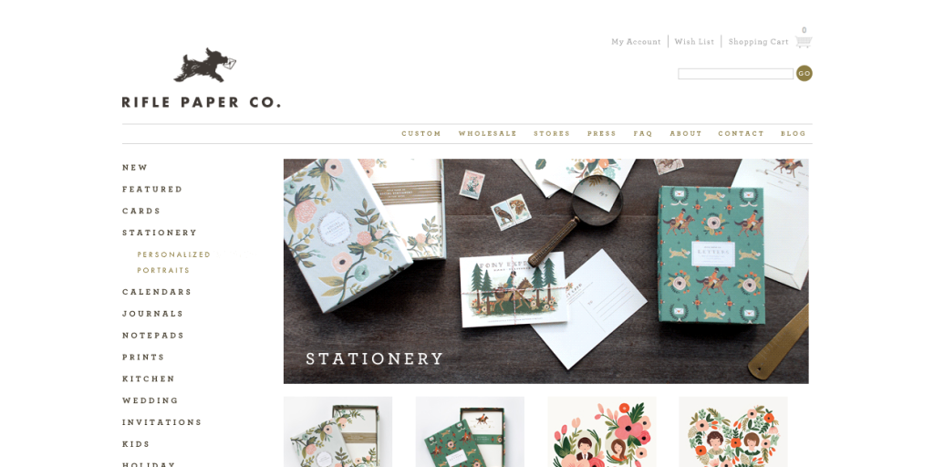
This is a website for a stationary online shop. Rifle Paper Co. have a very visual website meaning a lot of images to look at, as this is how they promote and sell their products online, so it is not dissimilar from a photographers website. The website has primary and secondary navigation bars, one has similar options to what mine will; press, about, contact, blog etc. But it has a more prominent one to help promote what they sell such as; new stock, cards, stationary etc. This gives the viewer easy access to their shop to browse the products, but also means that having the secondary navigation means you can access other aspects of the company such as where there shops are located, FAQ etc.
Like the Tim Walker site they have chosen to use a typeface that is in block capitals, and also has the drop down in the navigation. The layoutof the navigation. logo, hero image are very similar to Tim Walkers site, but this one as it is a shop also has a header which offers viewers the shopping options to view their shopping basket and sign in to their account. Obviously I would not have these options in my site.
Overall I think its a lovely layout and design, also I like the idea that where the four smaller images below the hero image (sorry the screen shot has cropped through it) could act as (for my site) teasers so for example instead of having a teaser with text I would have a row of teasers of images, like here, but each one could link EITHER to a different project of mine, chronologically, so most recent on the left, second most recent on the left of that etc, so each ‘image teaser’, if clicked on would take the viewer to a gallery of that project. So this would be updated regularly and viewers would see my latest work when ever they viewed the site, meaning it would often look slightly different. OR with the same idea of four ‘image teasers’ I would use each one to take the viewer to a gallery, like before, but it would be more permanent so one might have a image and underneath it would be labled ‘portraits’, the next box with a image ‘still life’. I think its important to have my work categorised into genre’s or projects as we do so many differnt types of photography and if they were all in the same gallery it would look unprofessional and messy.
Alternativly these projects or genres could be broken down in a sub navigation style, like on this website under ‘stationary’ comes the different options; personalized and portraits. Have a look at the website here.


